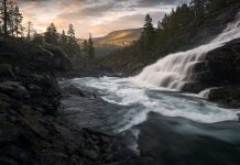
Composition is key in photography. It doesn’t matter how good the light is or how much you tweak the image in post-processing; without a strong composition, the image will never be anything other than a ‘nice snap’.
It’s also a difficult topic to teach. There are endless guidelines and so-called rules but you can’t apply them all at once. In fact, sometimes you shouldn’t apply any at all. That’s why I tend to refer to them as compositional guidelines rather than rules.
In this article, I want to introduce you to the top 5 compositional guidelines that I use the most frequently in my photography and that I believe will have a positive impact on yours. You might have heard about a few of these before but hopefully, some of them are new as well.
#1 Dark to Bright
This is a well-known technique in the art world but for some reason, it’s one that’s often neglected in landscape photography.
Applying the Dark-to-Bright compositional technique will improve the visual impact and help guide the viewer through the image.
So what exactly does this mean? Well, our eyes tend to be drawn toward brighter parts of a frame, so it’s important that the brighter areas are nearby the main subject of the image. By darkening areas further away, such as the borders of the image, you almost force the viewer towards the bright area.
Take the image above as an example. The dark shadowy hills help push your eyes up toward the brighter sunlit mountains. Keep in mind that there are just enough details in the darker landscape for it to remain important to the scenery as a whole. Had it been pure black, it could’ve had the opposite effect.
The dark-to-bright compositional technique is one that’s not always possible to apply in the field; sometimes it needs to be done through careful dodge and burn or other post-processing techniques.
#2 Cold to Warm
The second compositional guideline that you should learn to use is similar to the previous but instead of talking about the luminosity of an image, we look at the colors. Studies have shown that the human eye, as with brightness, is attracted to warm tones. This is something we can take advantage of in photography.

By using cold and desaturated tones in less important areas of the image and warm bright tones in the rest, we can help guide the viewer toward the main subject.
Combining this technique with the previous is an efficient way to quickly improve the visual impact an image has.
#3 Leading Lines
I’m sure that this is something many of you already are familiar with but it’s one worth repeating: take advantage of leading lines.
Look for foreground elements that lead up toward the main subject. This can be a path, a river, a lodge, a field of flowers, or even clouds. There’s a good chance that these leading lines will make a big difference in an otherwise average image.

The most important thing to be aware of when working with leading lines is where the lines are leading. Make sure that they help guide the viewer toward the main subject, not away from it.
In the image above, the dark lines in the sand lead directly up to the mountain which helps emphasize its importance. However, the snow is leading just south of the mountain which can be a distraction. Had it not been for the strong lines in the sand, this composition might not have worked.
#4 Clean Corners
The fourth tip is perhaps slightly more difficult to implement. For an image to look great, you always need to ask yourself ‘does everything in the frame contribute to the image?’. If there are parts that are distracting they should be removed. This can be done either by moving the tripod, zooming in, cropping, or removing it in post-processing.

The image above is a good example. Notice that the rock on the right side is cut in half; this is something that grabs more attention than necessary. By zooming in, cropping a little, or making a slight adjustment to our perspective, we can easily fix this.
#5 Big to Small
The final compositional guideline we’ll look at is the use of big-to-small or close-to-distant objects. This, combined with leading lines, will ‘suck’ the viewer straight into the image and lead them toward the main subject.

Let’s take the image above as an example. By using a low perspective, I was able to put the emphasis on the cracks in the ice and use these as leading lines to the rock in the center, which appears much smaller due to using a wide-angle lens. The big lines in the foreground serve as a natural place for the eyes to land when first viewing the image and the rock creates additional depth.
Conclusion
A strong composition can be what makes or breaks an image. It’s a big part of the creative process but it’s also a big part of the viewer’s experience. A good composition will make the viewer enjoy the work more.
What’s important when you set up your composition is to be aware of what you’re doing. You shouldn’t go and apply all the guidelines above. But you should learn how each and one of them can help improve the image you’re working on.
Take the Rule of Thirds as an example. This famous compositional technique is an easy but efficient way to make your work stand out. However, there are just as many amazing images that don’t follow it. But, most likely, they do use another guideline.
Are you paying attention to the composition when setting up your images? Then I’d love to hear which guidelines you tend to follow the most. Let us know in the comments below.
Want to learn more about composition in landscape photography? Then make sure to read our in-depth article, Composition in Landscape Photography: The Complete Guide.
DID YOU ENJOY THIS ARTICLE? THEN DON’T FORGET TO SHARE!


