

The Color Grading tool in Lightroom replaced the Split Toning Tool that many are familiar with. But is it any better? Is there a point in learning and implementing it into your workflow?
While that depends on your post-processing ambitions there’s no getting around the fact that this is one of the best new tools that’s been added to Lightroom in recent years. It’s complicated at first glance but when used right it gives wonderful results.
Let’s take a closer look at what the Color Grading tool is and how you can use it to improve your post-processing.
What is the Color Grading Tool in Lightroom?
Videographers who are used to software such as Premiere Pro might be familiar with the color wheels in Lightroom’s Color Grading tool. In fact, many photographers may recognize them from other photo editors such as Capture One.
Lightroom introduced this tool in their v10.0 update and for the first time in what seemed like forever, photographers are united in being thrilled. After some testing, they see just how crucial this tool has the potential to become in their processing workflow.

Simply put, the Color Grading Tool is used to introduce a specific color into your photos. This color can be added to the shadows, midtones, or highlights, or globally across the image. With the help of two additional sliders, you can adjust exactly how it’s applied (i.e, if it’s heavier on the darks or brights, or how much overlap it is between the tones)
How to Use the Color Grading Tool
The Color Grading Tool might appear confusing and overwhelming at first glance, but don’t worry. It’s a lot easier to use than you might think.
It is slightly more advanced than most other tools in Adobe Lightroom but more advanced also means it has a huge potential. Let’s take a closer look at the layout and the different features, and what they do.
Tool Layout & Overview
The Color Grading Tool is located in the Develop Panel directly beneath HSL/Color. Click on the tab to expand the panel to find the default tool layout. Here you are greeted with five small icons, three color wheels with a slider beneath each, and a Blending and Balance slider at the bottom.

#1 Adjust Icons
The first feature comes in the shape of 5 smaller icons, all circular and representing a wheel. These icons serve as buttons and change the beneath layout based on which tones you want to target:

- 3-Way is the default layout where you can adjust the Midtones, Shadows and Highlight color wheels
- Shadows hides all color wheels except for the one targeting the shadows
- Midtones hides all color wheels except for the one targeting the midtones
- Highlights hides all color wheels except for the one targeting the highlights
- Global reveals a color wheel that affects the entire image, regardless of its luminosity
I strongly recommend using only one of the color wheels at a time when using this tool. The color wheels are too small to get accurate results when using the 3-Way layout. You’ll get much more precise results when using the Shadows, Midtones or Highlights color wheels individually.
#2 Color Wheels
The main feature of the Color Grading tool in Lightroom is the color wheels. The default layout is the 3-way view where all three of them are visible. Note that the global color wheel is only accessible by clicking its specific icon.
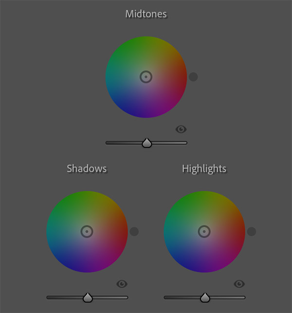
The wheels, or circles, are used to introduce colors of different hues and saturation to specific parts of your images. Click inside the circle and pull the knob around to adjust the color.
Rotating the knob around the circle changes the hue of the color while pulling it in towards the center or out towards the edge decreases or increases its saturation. The further away from the center, the more saturated the color becomes.


There’s also an eye icon to toggle the effect on/off and a Luminance slider found beneath each wheel. The Luminance slider is used to increase the brightness of the selected color.
We’ll come back to exactly how to use the color wheels in a minute. First, we’ll take a look at the last few, and important, features.
#3 Blending & Balance Sliders
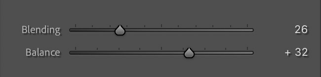
The third, and at first glance final, feature is the Blending and Balance sliders that give better control of how the selected color is introduced to the photo:
- Blending is used to adjust the color’s overlap between the shadows and highlights. Dragging the slider to the left reduces the overlap, meaning there’s a more distinct transition between shadows and highlights, while dragging it to the right has the opposite effect.
- Balance is used to adjust how the effect is balanced between the shadows and highlights. Keeping the slider at 0 balances the effect equally. Dragging the slider to the left increases the effect in the shadows (and reduces in the highlights) while dragging it to the right does the opposite.
The Blending and Balance sliders aren’t tied to the individual color wheels; they affect the image globally. That means if you adjust the sliders while working on the Highlight’s color wheel, it also moves beneath the other.
#4 The Hidden Hue & Saturation Sliders
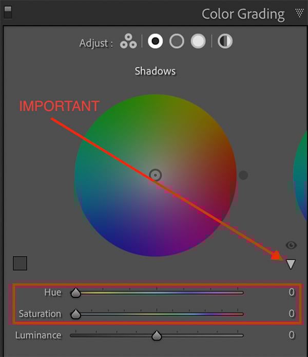
At first glance, the Blending and Balance sliders are the final features of Lightroom’s Color Grading Tool. That’s not the case.
There are two more sliders that, for some reason, are hidden by default: the Hue and Saturation sliders. These are quite important and will be helpful in fine-tuning the adjustments so make sure to open them right away.
You can reveal these sliders by clicking the little arrow beneath the eye icon when editing the Highlights, Midtones, Shadows or Global color wheels. It is not visible in the 3-way view.
The Hue and Saturation sliders are representations of the color wheels themselves. You’ll see that their values change when pulling the wheel’s nodes. They come in handy when you’ve found a color you want to use but need to refine it.
If you find yourself unsure which adjustments to use, when to use them, or how to combine them without second-guessing, I’ve put together a workflow-based set of Lightroom tools designed to help with exactly that.
The Lightroom Toolbox isn’t about one-click looks. It’s a collection of adjustable tools you can use, tweak, and learn from as you develop your own editing workflow.
How to Use the Color Grading Tool in Lightroom
Now that we’ve looked at the layout and different features, it’s time to look at how the tool works and how you can implement it into your processing workflow.
Seeing that the color wheels are quite small when working in the 3-Way mode, I recommend working with the Highlights, Midtones and Shadows individually. This helps with precision and allows you to use the Hue/Saturation sliders instead of trying to hit jackpot with the wheel.
Any adjustment to the Hue, Saturation and Luminance made using the Shadows color wheel will, as you might have guessed, only affect the shadows. Some of the effects blend over to the midtones or highlights depending on the Blending and Balance values.
Using the Color Wheels & Sliders
You’ll quickly notice that nothing happens when adjusting the Hue slider until you increase the saturation above zero. A useful trick is to start by increasing the saturation to a value higher than what you’re going to use. This might look awful when you then adjust the hue but it’s helpful in finding the correct color. You can then reduce the saturation to a more suitable value afterward.
Using the color wheels can be a good way to find the color you want but I strongly recommend using the sliders to fine-tune it. It’s hard to get the exact color you want without doing so.
In the example below, I wanted to introduce a cold blue to the shadow areas. I started by dragging the knob inside the color wheel around until I found a hue close to what I imagined. The next step was then to reduce the saturation to a more fitting value and then use the Hue slider to fine-tune the color.
I ended up using the following values:
- Hue: 233
- Saturation: 32
- Luminance: 13
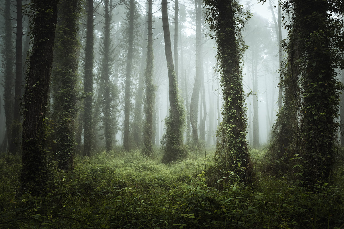
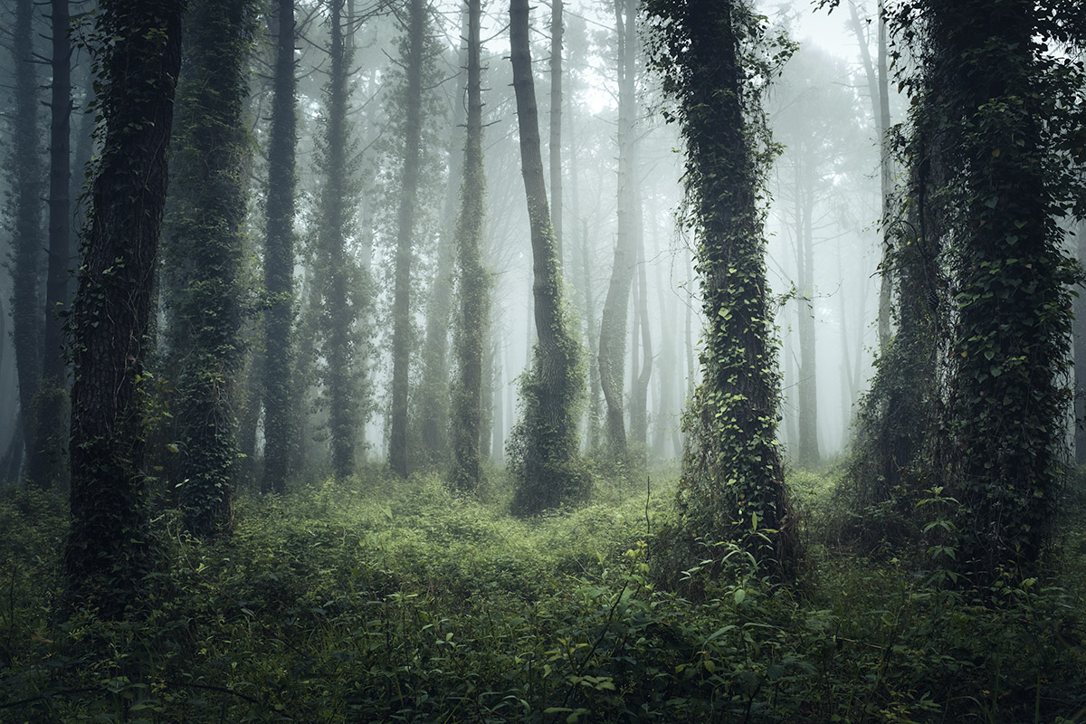
The cold blues are mainly introduced to the darker parts of the image. Yet, due to the Balance and Blending sliders, some of the effect blends into the midtones.
After applying this color adjustment to the shadows you can move on and do the same for the midtones and highlights. Keep in mind that it isn’t always necessary to add adjustments to all of them. In fact, it quickly leads to looking ‘too much’.
Color Grading Keyboard Shortcuts
Many photographers have complained about how sensitive the Color Grading wheels are and that it’s hard to get accurate results. This is true but, luckily, there are a few keyboard shortcuts to help.
Use the following keys while dragging the color wheel’s node:
- Option (Mac)/Alt (Windows): Makes the controls less sensitive and easier to use for accurate results.
- Shift: Adjusts only the Saturation.
- Command (Mac)/Ctrl (Windows): Adjusts only the Hue
It’s also possible to increase the Hue/Saturation using the same keyboard combinations as with other sliders (i.e. Option/Alt + Up = increase Saturation with 1 or Option/Alt + Shift + Up = increase Saturation with 10)
In-Depth Color Grading Video
It’s good to also have a visual explanation of how the Color Grading tool work, which is why I highly recommend looking at this in-depth and extremely useful video by f64 Academy. Here you see just how the Blending and Balance sliders affect your adjustments, and you get a good introduction to the tool.
This video focuses on Color Grading in Adobe Camera RAW but it looks and works just the same as in Lightroom.
Color Grading in Adobe Photoshop
Color grading is, as mentioned, an important part of any photographer’s workflow. Many prefer having this as a step later in the workflow when the image is being processed in Adobe Photoshop. There are many various ways of color grading in Photoshop (with tools such as Color Balance, Photo Filter or the Hue/Saturation Adjustment Layers) but it’s also possible to access the Color Grading Tool.
This is done through Adobe Camera RAW. It’s important to first create a Merged Visible or Stamp Layer for this to work best. Converting it to a Smart Object gives you extra flexibility later on in the workflow.
Next, go to Filter -> Camera RAW Filter… This opens a new window with tools that looks familiar to Adobe Lightroom.


The color wheels and other features work exactly the same as in Adobe Lightroom. When you’re done applying the color adjustments (and any other adjustments in Camera RAW), click OK. The adjustment is now visible in Photoshop and you can use the Layer Mask to make further restrictions if needed.
Color grading is one of the adjustments I build into most of my landscape presets. If you want to see it applied as part of a broader workflow, the Lightroom Toolbox includes 70+ landscape presets where color grading plays a central role in the overall look.
Conclusion
The Color Grading Tool is an incredibly powerful tool for all types of photographers but it can just as easily make your images look horrible. I recommend using a combination of the color wheel and its sliders in order to fine-tune the color.
It’s not an easy tool to use for Lightroom beginners, but it’s one that you will benefit from learning.
The good news for experienced Photoshop users is that the Color Grading Tool also is available in Adobe Camera RAW. This makes it easy to take advantage of its powerful features without the need of hopping back and forth between Adobe Lightroom and Photoshop.
This is a tool that many photographers will find crucial to their post-processing workflow.
Do you use the Color Grading tool in Lightroom? Leave a comment below and let me know what you think!
DON’T FORGET TO SHARE THIS ARTICLE


")

