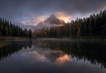
An image pleasing to the eyes is a combination of many factors of which colors, in my opinion, are a major piece of the expression. Lightroom, Photoshop and many other editing programs come with a variety of color enhancing tools. We will in this brief article have a look at two color enhancing techniques I apply frequently and which can be carried out very swiftly in Lightroom. Contrary to the HSL section in Lightroom, these enhancements won’t leave any harsh transition lines between colors. The transitions are smooth and pleasing.
My favorite time to shoot is during the golden hour, that is, sunsets. Sunrises are in the middle of the night this far north during summer, and since I am not a morning person I prefer sunsets. The approaches we will have a closer look at are perfect for golden hour images.

Below the HSL section in Lightroom we find the Split Toning section which is divided into two separate parts, Highlights and Shadows, which target different tonal values in an image.
After having adjusted the tonal values in Lightroom so that I have no clipping in either end of the histogram I open up the Highlights’ color picker in the Split Toning section. Click on the rectangular box and a new pop up window appears in which you can move a color picker around choosing whichever color you please. Here I pick a warm color that accentuates and enhances the warm colors already present in the image. Be careful to not overdo it – clipped colors or over-saturated colors aren’t exactly very pleasing to the eye.
Recommended reading: How Understanding the Histogram Will Improve Your Photography
Next I head to Shadows and do the same as with highlights but now I’ll pick a cold color for the shadows, usually something bluish. Here I just add a very modest tint of the color of my liking and I try to find colors in both sections that work together, that is, which are as complementary as possible.
Very often what we do in the highlights section will wash out the beautiful blues we have in the highlights, that is, in the sky or water. And usually we do want to restore our blues and not leave them too faded or warm looking.
This is easily achieved in the Camera Calibration section in Lightroom where we find four various sliders. I am only interested in the one at the bottom – the slider named Blue Primary. Push it to the right and see what happens.
Not only does it give the image a pop, it adds contrast, enhances colors and restores the blues in the highlights. Again, try to avoid overdoing it. Now and then our highlights might become clipped when we have pushed the blue slider to the right which means we have to readjust the tonal values in the image with the help of the highlights, whites or lights sliders in the tonal value sections in Lightroom.
It is at this point I may turn my attention to the HSL section in Lightroom and make small adjustments to hue and saturation – very gingerly to avoid transition lines. And I may also push the Vibrance slider a tad to the right.
I do a lot of midtones work in Photoshop and use various masks to target specific tonal values or colors which always result in a color boost so that my personal preference is to hold back on the above mentioned adjustments in Lightroom.


Great stuff, Ole. Solid approach to color grading.
Cheers,
Daniel (Laanscapes)
Hi Daniel!
Thank you for commenting. I’m happy you enjoyed Ole’s approach.