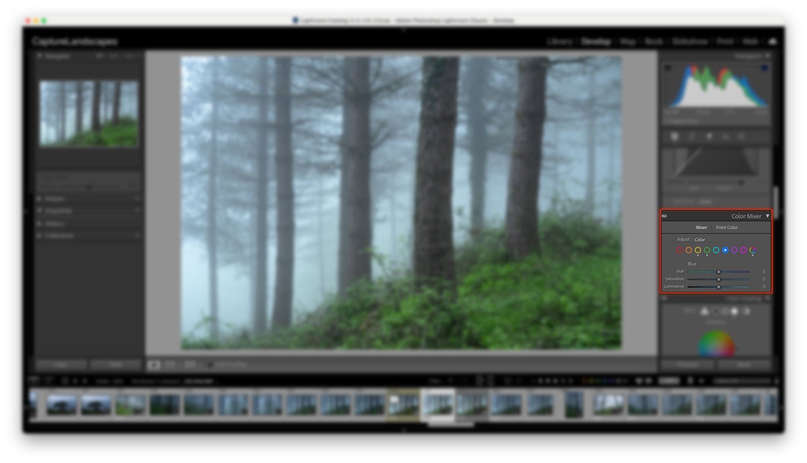
The Color Mixer is Lightroom’s most important tool for targeted color adjustments. Unlike the global Saturation and Vibrance sliders, which affect all colors in your image at once, the Color Mixer lets you work independently on the color channels: red, orange, yellow, green, aqua, blue, purple, and magenta.
It contains two tools: Mixer and Point Color. The Mixer gives you the familiar HSL controls (Hue, Saturation, and Luminance) organized either by adjustment type or by individual color. Point Color takes a different approach, letting you select a precise color directly from your image using an eyedropper and adjust only that color.
In this guide, I’ll explain how both tools work, how I use them in my landscape photography workflow, and how to get the most out of the Color Mixer for more precise, natural-looking color edits.
If you’re also looking to improve your broader color editing workflow, the Color Grading tool works alongside the Color Mixer and is worth understanding as well.
Jump to Section (Click to Expand)
Where is the HSL Panel in Lightroom Classic?
If you’re looking for the HSL panel after updating Lightroom Classic, here’s where to find it:
- Open your image in the Develop module
- On the right-hand panel, scroll down until you see Color Mixer
- Click to expand it, then select Mixer
- Under the Mixer tab, you’ll find an Adjust dropdown; set this to HSL to see the familiar Hue, Saturation, and Luminance sliders
Nothing has changed about how HSL works, only its location and the panel name. If you’ve been using the HSL panel for years, you’ll feel right at home the moment you find it.
What is the Color Mixer in Lightroom?
The Color Mixer is Lightroom’s primary tool for making targeted color adjustments. Rather than adjusting all colors in your image at once, as the global Saturation and Vibrance sliders do, the Color Mixer lets you work on individual color channels (red, orange, yellow, green, aqua, blue, purple, and magenta) independently.
This makes it far more powerful for fine-tuning the colors in landscape photography, where the difference between a blue sky that looks natural and one that looks over-processed often comes down to very precise adjustments to a single channel.


The Color Mixer contains two separate tools:
Mixer: the renamed HSL panel. This is where you adjust Hue, Saturation, and Luminance for each color channel, exactly as before.
Point Color: a newer addition that lets you select a precise color from your image using an eyedropper and make targeted adjustments to that specific color only. More on this below.
Recommended Reading: 9 Easy Lightroom Tips for Landscape Photographers
Understanding Hue, Saturation and Luminance
Before getting into how to use the tools, it’s worth clarifying what the three HSL adjustments actually do. If you pull sliders without understanding what they control, you’re just guessing.
What is Hue?
Hue adjusts the shade of a color, shifting it along the color wheel toward a neighboring tone. For example, dragging the Blue Hue slider left shifts blue tones toward aqua; dragging right shifts them toward purple.
I use small Hue adjustments regularly in my landscape work. Shifting the green channel slightly toward yellow or aqua can make vegetation feel more natural, while fine-tuning the blue channel can take a sky from looking slightly gray to a richer, more convincing blue. Small adjustments go a long way here; pulling sliders to the extremes quickly makes colors look unnatural.

What is Saturation?
Saturation controls the intensity of a color. Increasing saturation makes a color more vivid and prominent; decreasing it pushes the color toward gray. At -100, a color becomes completely desaturated.
This is useful for both enhancing and suppressing colors. If the orange tones in a sunset feel too muted, a small increase to the Orange Saturation channel will bring them out. If a green field is competing too strongly with your subject, pulling the Green Saturation back can settle it into the background.


This is a very important feature. It’s easy to get carried away with the general saturation slider but it’s very rare that you want all the colors to be affected. Working with the specific colors is slightly more advanced but the results will be a lot better.
Recommended Reading: Saturation vs Vibrance – What’s the difference?
What is Luminance?
Luminance controls the brightness of a specific color. Increasing the luminance of a color makes it lighter; decreasing it makes it darker.
For landscape photography, the most common use is darkening the Blue Luminance channel to deepen the sky without affecting the rest of the image. This can be more precise and natural-looking than trying to achieve the same effect with a graduated filter or a masking adjustment.


How to Use the Mixer Tool: HSL Mode vs Color Mode
Within the Mixer tab, you have two ways to view and interact with the sliders, controlled by the Adjust dropdown: HSL and Color. They do exactly the same thing; the only difference is how the sliders are organized.
HSL Mode
In HSL mode, Lightroom groups the sliders by adjustment type. You see all eight Hue sliders together, then all eight Saturation sliders, then all eight Luminance sliders. This is useful if you want to work through one type of adjustment across all your colors at once; for example, fine-tuning all your Saturation values in a single pass.
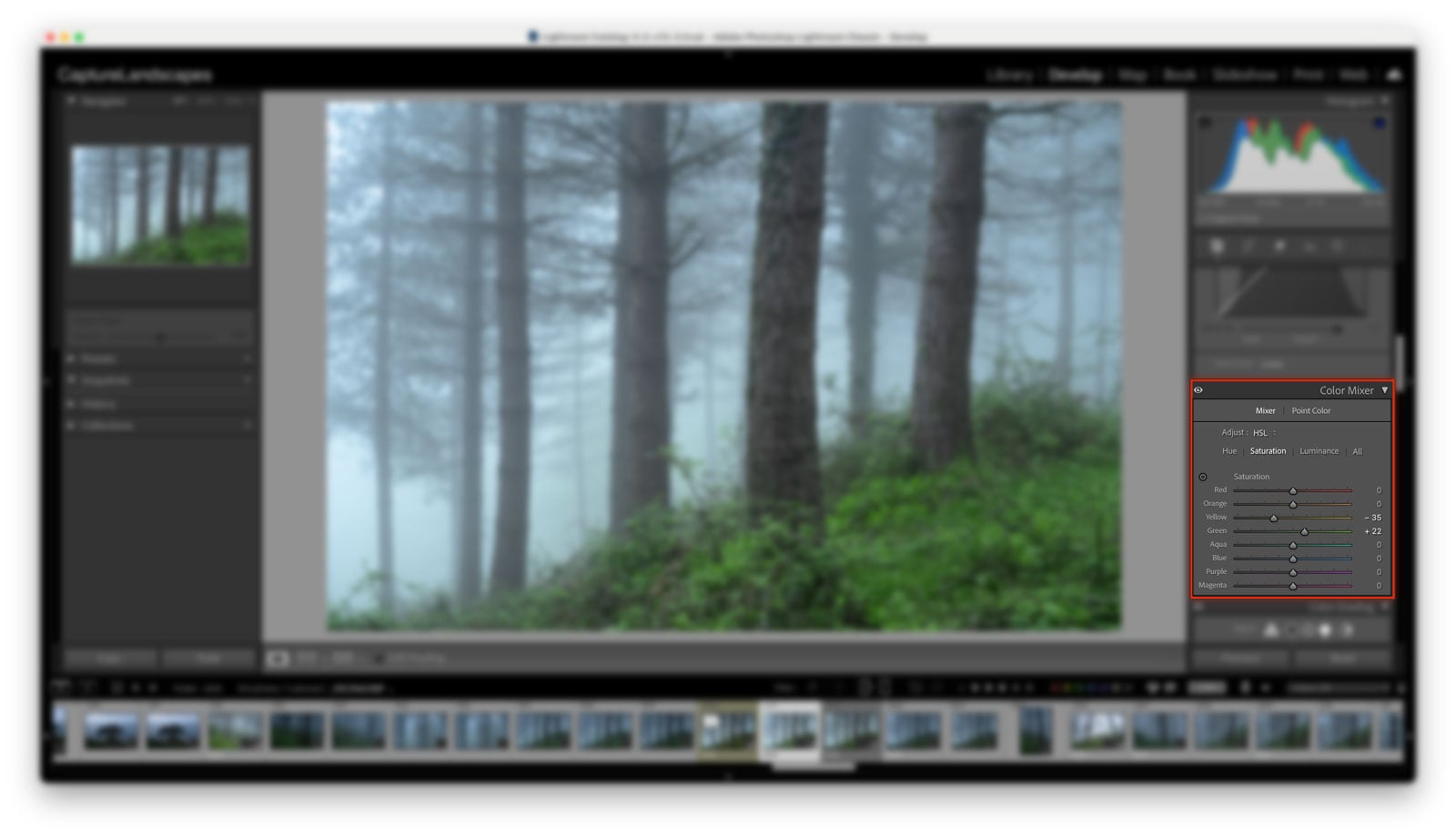
Color Mode
In Color mode, Lightroom groups the sliders by color. You select a color channel, and it shows you the Hue, Saturation, and Luminance sliders for that color together. This is how I personally prefer to work. My brain tends to think in terms of individual colors rather than individual adjustment types; when I’m working on the sky, I want to see all three sky-related controls in one place. When I move to the vegetation, I switch to green and work through its Hue, Saturation, and Luminance in one go.
Neither mode is more correct than the other. It comes down to how you naturally think about color.
The Targeted Adjustment Tool
Both modes include the Targeted Adjustment Tool, accessed by clicking the small circle icon in the top left of the panel. With this active, you can click directly on any area of your image and drag up or down to adjust the corresponding color channel. Dragging up increases the value; dragging down decreases it.
This is particularly useful when a color in your image doesn’t fit neatly into a single channel. Skin tones and certain sunset colors can fall between orange and red, for example, and using the Targeted Adjustment Tool lets Lightroom figure out the right channel rather than you having to guess.
How to Use Point Color
Point Color is the newer of the two tools inside the Color Mixer, and it works differently from the Mixer. Rather than working across predefined color channels, Point Color lets you use an eyedropper to select a precise color directly from your image and then adjust only that color.
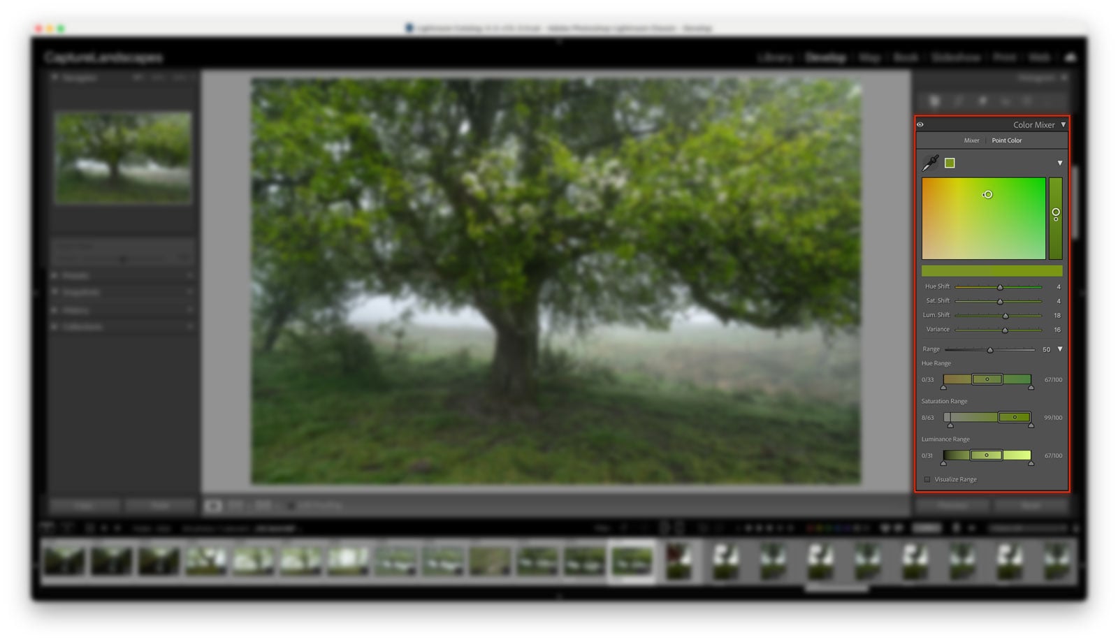
This sounds powerful, and it is, but it comes with an important limitation that’s worth understanding before you use it.
Because Point Color selects a color range rather than a masked area, it will affect every pixel in your image that matches that color. If you select the blue of a flower to adjust, it will also affect the sky, any water, and anything else containing a similar blue. For a broad landscape, this can cause problems that are difficult to spot until you zoom in.
The way I’d approach Point Color in a landscape workflow is to combine it with a Mask. For example, if you’re photographing a field of wildflowers and want to shift the blue flowers without touching the sky, create a mask selecting the foreground area first, then use Point Color within that mask to select and adjust the blue. That way, your adjustment is constrained to only the area you’ve masked, and the sky is completely untouched.
This combination of masking and Point Color is genuinely powerful for selective color work. But for the broad global adjustments I make on most of my landscape images, the Mixer is the tool I reach for first.
Color Mixer for Landscape Photography: How I Use It
Here’s how the Color Mixer fits into my actual editing workflow.
Most of my color work happens in Color mode, working through the channels that matter for the specific image I’m editing. For a typical landscape, that usually means spending time on three channels:
Blue — I almost always reduce the Blue Luminance to deepen the sky and give it more weight in the image. I’ll also often pull the Blue Saturation back slightly, giving the sky a more muted, dramatic quality rather than a vivid postcard blue. For daylight images where I want a cleaner, more natural sky, I might be less aggressive with the saturation, but for the moody, atmospheric look I tend to go for, less is usually more here.
Green and Yellow — Vegetation can easily look either too yellow or too artificially saturated straight out of the camera, especially in summer landscapes. My instinct is usually to drop the Green Saturation rather than increase it, and to shift the Hue slightly toward yellow. That combination creates a more muted, grounded tone that suits the darker, more dramatic atmosphere I look for in my images.
Orange — For golden hour and sunset images, the Orange channel is where I spend the most time. A small increase in Orange Saturation enhances the warmth of the light, while the Hue slider lets me shift the orange tones toward a deeper amber or a lighter yellow depending on the mood I’m going for.
The adjustments I make are almost always small. The Color Mixer is not a tool for dramatic transformations; it’s a tool for precision. If you find yourself pulling sliders more than 20–30 points in any direction, it’s usually a sign that something earlier in the edit needs fixing first.
If you’re looking for a starting point for your Lightroom color workflow, the Lightroom Toolbox includes over 70 workflow presets for landscape photography, each built around careful use of the Color Mixer as part of a complete edit.
Tips for Better Color Adjustments in Lightroom
A few practical principles that apply whether you’re using the Mixer or Point Color:
Work with small adjustments. The most common mistake with the Color Mixer is going too far. Colors that look vivid on screen can appear garish in print, and over-saturated images age quickly. Start with smaller moves than you think you need and build from there.
Use the before/after toggle. The backslash key (\) in Lightroom Classic toggles between your edited and original image. Use this regularly when working with the Color Mixer to check whether your adjustments feel natural or processed.
Fix white balance before touching the Color Mixer. If your white balance is off, you’ll end up chasing the problem through the Color Mixer without ever fully solving it. Get the white balance right first, then use the Color Mixer for fine-tuning. The white balance guide covers this in detail.
Be aware of color spill. When you adjust one channel in the Color Mixer, it can subtly affect neighboring colors. Orange and yellow overlap, as do blue and aqua. If something looks off after an adjustment, check whether a neighboring channel is being pulled along with it.
Combine with Color Grading for more control. The Color Mixer targets individual color channels. Color Grading targets the tonal ranges: shadows, midtones, highlights. The two tools work well together: Color Mixer for color accuracy and channel-specific tweaks, Color Grading for atmosphere and overall mood. For more on how Color Grading works, see the Color Grading in Lightroom guide.
The Color Grading tool is now also available in Nik Color Efex 9, which is worth knowing if Color Efex is part of your workflow.
Conclusion
The Color Mixer is one of the most important tools in Lightroom for any photographer who cares about precise color control. Whether you’re working in HSL mode or Color mode, the Mixer lets you adjust individual color channels with a level of precision that global sliders simply can’t match.
Point Color extends that precision further for specific, targeted adjustments, and when combined with Lightroom’s masking tools, it becomes a genuinely powerful option for complex color work.
For landscape photography specifically, the Color Mixer rewards a careful, restrained approach. Small adjustments to the blue sky, the greens in your vegetation, and the warm tones in your highlights can transform an image without it ever looking processed.
For a complete overview of how post-processing fits into your landscape photography workflow, the post-processing guide covers everything from RAW optimization through to export.
If you want to go deeper into the thinking behind these color decisions, not just which sliders to move, but why, Edit With Intent covers the complete post-processing philosophy behind my landscape work.
DON’T FORGET TO SHARE THIS ARTICLE
-
 Edit With Intent$ 27.00
 -
 The Lightroom Toolbox$ 59.90
 -
 Dramatic Landscapes Lightroom Presets$ 29.90